Angelo

Mips Media

As a web designer, I led the redesign of Mips Media’s website, creating a modern, user-friendly experience that clarifies services, improves navigation, and engages clients more effectively.
Role – Web Designer, Responsive Design
Team – Owner & Developer
Duration – 3 months
Tools – Adobe XD

Key Outcomes & Results

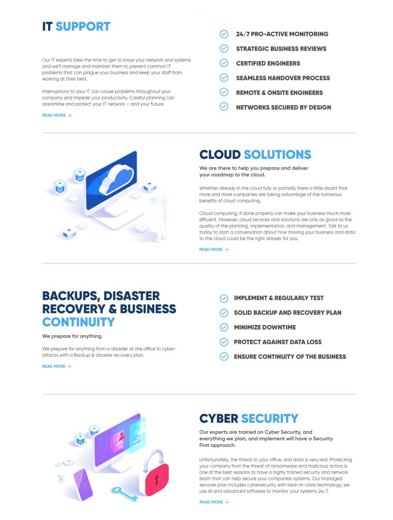
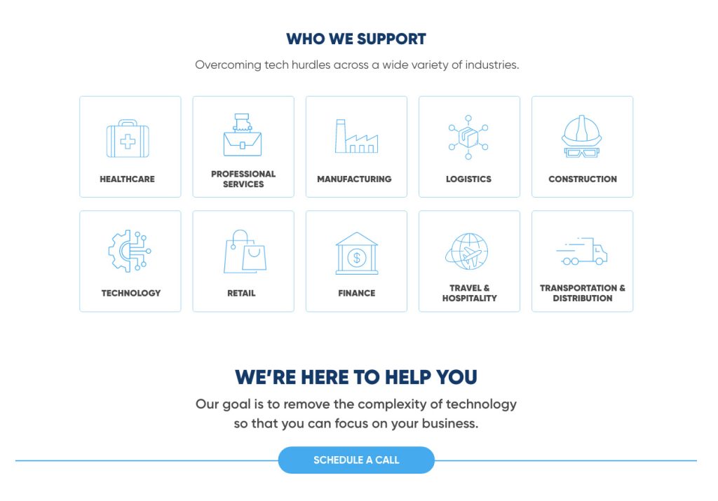
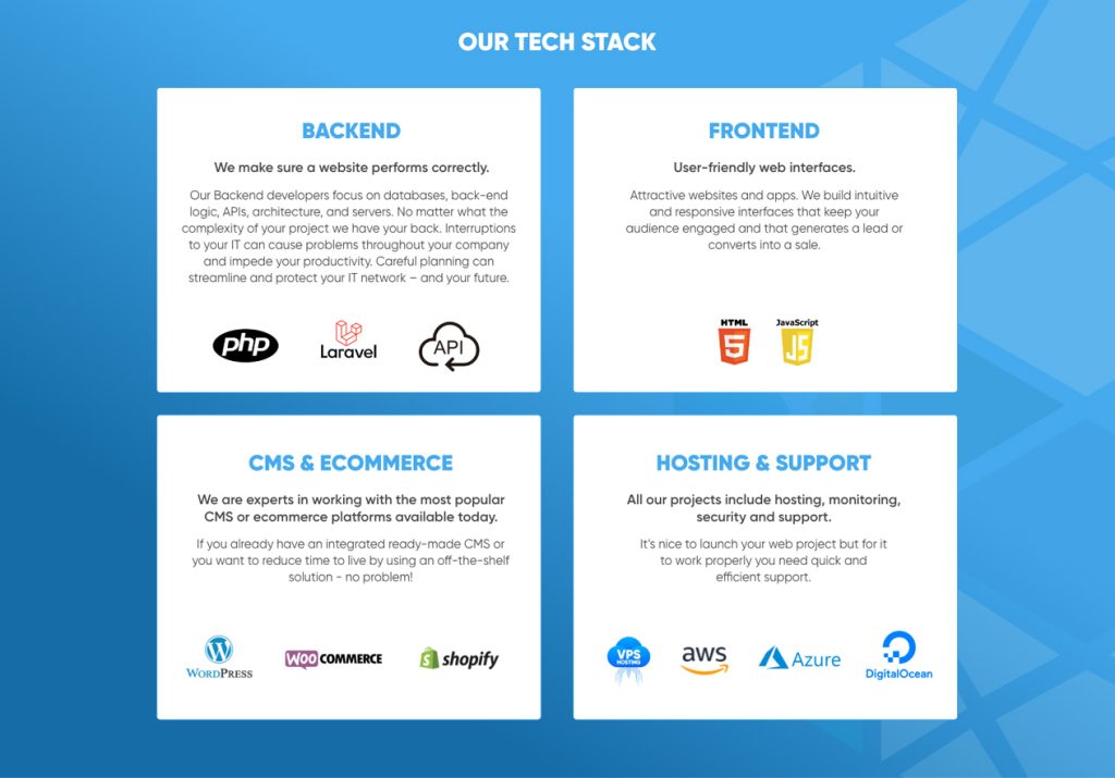
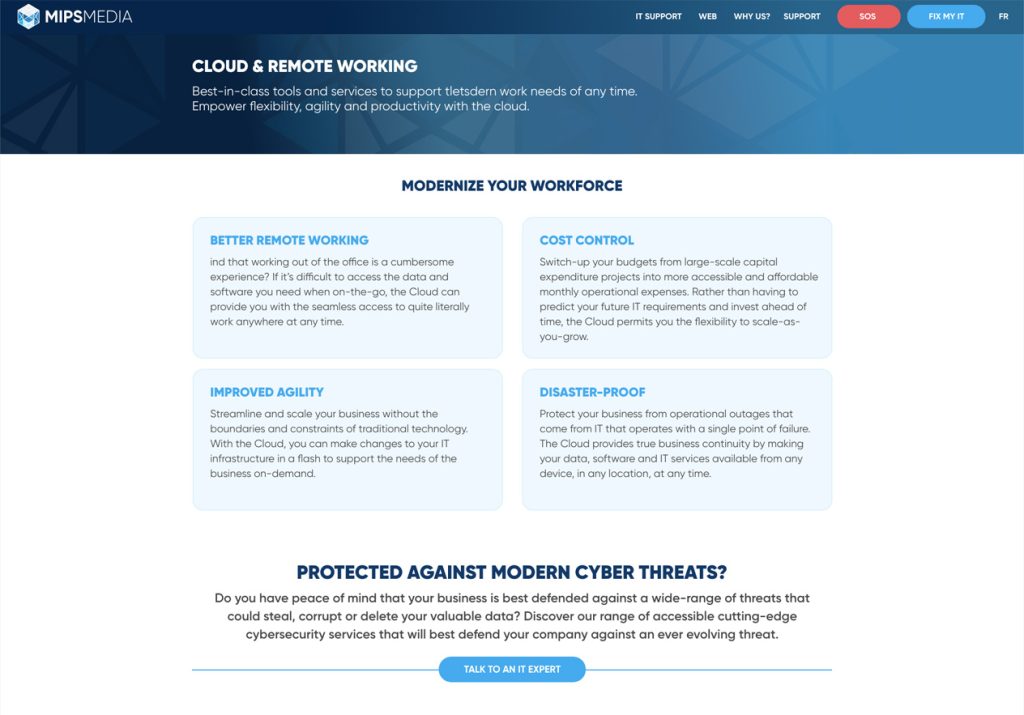
Organized and highlighted the firm’s offerings, making it easier for visitors to understand capabilities and find the solutions they need.
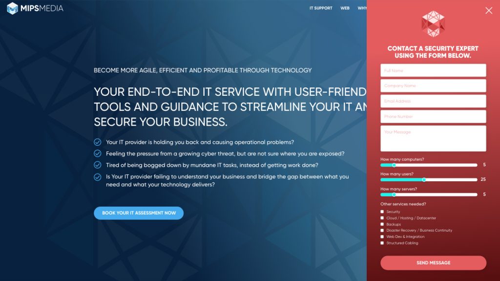
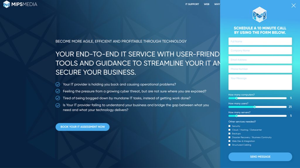
Streamlined navigation and added clear calls-to-action like “SOS Urgent Request” and “Talk to an Expert” to guide users toward immediate support and expert consultations.
Understanding the Problem
The firm’s existing website made it difficult for visitors to quickly understand services, access urgent support, or connect with experts. Navigation was unclear, content was scattered, and key calls-to-action were hard to find, creating friction for potential clients.
My Design Process
Organized the Content Into a Clearer Structure
Restructured information and navigation to create intuitive pathways for users to explore initiatives and find what they needed quickly.
Sketched Wireframes to Plan Layouts and Flows
Developed low-fidelity wireframes to explore hierarchy, layout, and user flow before moving into detailed design.
Refined the Design Through Iteration
Incorporated feedback and usability insights to enhance consistency, engagement, and overall user experience.
My Design Contributions
Showcasing Services on the Homepage
Organized and highlighted the firm’s offerings on the homepage, making it easy for visitors to understand capabilities and quickly find the solutions they need.
Refined the Color Palette to enhance Brand Consistency
Refined the color palette to improve contrast, readability, and consistency, making the site easier to navigate while strengthening Mips Media’s brand identity.
Adding Urgent and Expert Contact Options
Added an “SOS” contact form and a “Talk to an Expert” option to make it easy for users to get immediate support or connect directly with specialists.

Introducing Icons for Clearer Navigation

Added custom icons throughout the site to visually represent services, helping users quickly identify content and navigate the site more intuitively.
Showcasing the Tech Stack
Introduced and highlighted the site’s tech stack to demonstrate capabilities and build trust, making it clear which technologies power Mips Media’s solutions.
Creating a Clearer Layout with Bold CTAs
Redesigned page layouts to organize information more clearly and added bold calls-to-action, making it easier for users to understand content and take key actions quickly.

Key Learnings

Through this redesign, I learned the importance of creating a clear and organized website that makes it easy for visitors to understand services and take action. I focused on improving navigation, designing prominent calls-to-action like ‘SOS Urgent Request’ and ‘Talk to an Expert,’ and using visual elements like icons and color to guide users. The project reinforced the value of designing for both usability and business goals, ensuring the site is engaging, professional, and helps attract potential new clients.